Designing a shared UI library for several Angular applications
The useful part
Share behaviour with a stable contract. Keep permissions, domain rules and application data at the product boundary.
Several Angular applications often grow similar data grids independently. The second one is slightly different, the third one has the filter bar from the first and the paging from the second, and a year later a bug in the sorting has to be fixed in three places. A shared UI library can help. The risks are familiar: the library knows too much about the first product, it owns behaviours that a framework already owns, and nobody can see all of its states in one place.
This is how I structured the shared layer behind my own product, twelve packages under one @ui scope, and the rules that keep it reusable.
One job per package
The packages are small and named after their job: @ui/grid, @ui/forms, @ui/controls, @ui/upload, @ui/preview, @ui/details, @ui/communicator, @ui/commands, @ui/chat, @ui/map, @ui/service and @ui/catalog. A package that does two things has two reasons to change and two sets of consumers that break.
The boundary between them is a lint rule: packages may depend on each other, never on an application. The rule runs in CI, so a convenient import from the product into the library is a build failure, not a code review remark that gets waved through on a Friday.
Domain-free by construction
The libraries know nothing about the product that uses them. No parcel rules, invoice policies or hard-coded product language. Localized labels are supplied through the public API. The test is simple: could a banking back office or an ERP module use this package as it is? If a component needs a product-specific rule, the rule stays next to the screen that needs it and reaches the library through an input, a token or a registered strategy.
The API is neutral: English names, options instead of defaults borrowed from the first product, and coded errors that the application phrases in its own language. This is more work for the first consumer and far less for the second.
Example boundary: a grid in two products
A parcel screen and an invoice screen can share sorting, paging, column visibility and keyboard navigation. The parcel screen owns projection and land-register rules; the invoice screen owns approval and accounting rules.
| Shared grid | Product adapter |
|---|---|
| Stable row ID and selection state | Map parcel ID or invoice ID to the row |
| Loading, empty and error presentations | Fetch permitted data and translate errors |
| Action slot and keyboard behaviour | Decide who may approve, export or edit |
A useful check: load the same grid with another domain’s sample records. If the grid imports that application to work, the boundary is incomplete. UI visibility never replaces server-side authorization.
One owner per behaviour
A shared library is tempting to fill with implementations of things that already exist. Resist it. In my packages:
- keyboard, focus and ARIA behaviour come from Angular Aria and the CDK;
- grid data and state belong to TanStack Table, wired in a single file;
- form state belongs to Signal Forms.
The library adds composition, layout and the product-independent conventions, not a second implementation of focus management. When a behaviour has one owner, a fix has a clear home. Consumers still need to update, run their checks and deploy before a dependency patch reaches users.
Pure core, Angular view
Each package keeps a pure core, its model, state and rules with no view imports, apart from its Angular view. The core is tested in jsdom in milliseconds and can be reused by a different view, a test harness or a server-side process. The view is thin: it renders the core's state and forwards events.
The split also decides what a unit test is. A grid's filter logic is a core test with plain objects. The filter bar's keyboard behaviour is a view test, and only the states that depend on real layout go to a browser.
The look comes from tokens only
Every colour, radius, spacing and font in the libraries is a --ui-* custom property. A product restyles the whole layer by overriding properties in one stylesheet; it never reaches into a component's styles. Two products on the same packages can look unrelated, and a change of brand is a change of tokens.
Device rules are decided in the library once. Touch targets are 44 px on coarse pointers and compact under a mouse; no screen in any application has to remember that.
A living catalog, not a style guide
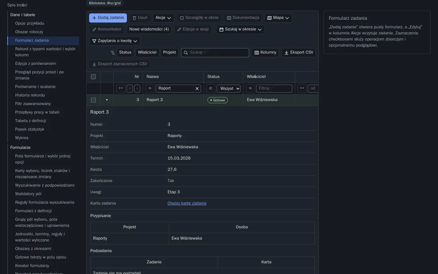
A style guide drifts from the code the week after it is written. A catalog is an application that imports the real packages and shows every pattern on the same sample data: 53 pages in seven groups, from data and tables to windows and feedback, with pretend servers where a backend would be.
The catalog has three jobs. It is where a new state is designed, because an empty grid and a grid with ten thousand rows are both one page away. It is the surface the tests drive. And it is the demo that a product team looks at before asking for a new component. It ships in development builds only, so the product's production bundles do not carry it.
Tests for important states
The same four checks run over every package and are the difference between a library and a folder of components:
- Unit tests in jsdom. The 1 October 2026 inventory counted 2,524 test declarations across the twelve packages. This describes scope, not the outcome of a fresh run. Targeted mutation checks: break the code, see it fail, restore.
- Scenarios per pattern. The same dated inventory records 819 Playwright scenarios driving the catalog as a user would, with the keyboard as well as the pointer.
- Accessibility across recorded states. axe checks catalog states at two viewport widths, including open overlays. Automated checks cover only part of accessibility: keyboard, focus order, screen-reader output and task completion still need manual assessment.
- Visual baselines. Twenty-two screenshots of catalog and application screens, desktop and phone, compared only on the CI agent, where fonts and rendering are stable.
A catalog page that adds a demo to a shared page can break neighbouring tests through page-wide locators. Scope locators to the demo's container from the start; it costs nothing on day one and saves a day later.
Versioning and release
In one workspace, the libraries and the applications are released together: a change in @ui/grid is tested against every consumer in the same gate, and there is no version matrix to maintain. That is the simplest model and it is the one I use.
Publishing the packages for teams outside the workspace changes the contract: semantic versions, a changelog per package, an agreed deprecation and migration policy, and a demo application that pins the published versions rather than the source. Choose the model before the second team arrives, not after.
Where to start in an existing code base
Start with one repeated behaviour and name its second consumer. Extract its stable contract; leave speculative options and product policy outside. The GeoAtlas workspace uses a library-first rule for behaviour already known to be reusable. The first package will be small and will absorb one duplicated behaviour. The second will absorb the next. After a few screens the catalog has its first pages, the lint rule has its first boundary, and the applications have stopped diverging.
The Reusable UI case study shows the result of that rule applied for one product; the architecture review service is where I help a team apply it to theirs.
Sources and scope
Package and test figures are the dated 1 October 2026 inventory in the case study. They are not a fresh passing test run or a claim of complete accessibility.