Controls · Angular, React and OpenLayers
Zoom sliders in three styles
Style OpenLayers ZoomSlider controls in three map layouts: default vertical rail, tucked between zoom buttons, and a compact horizontal bar.
What this example shows
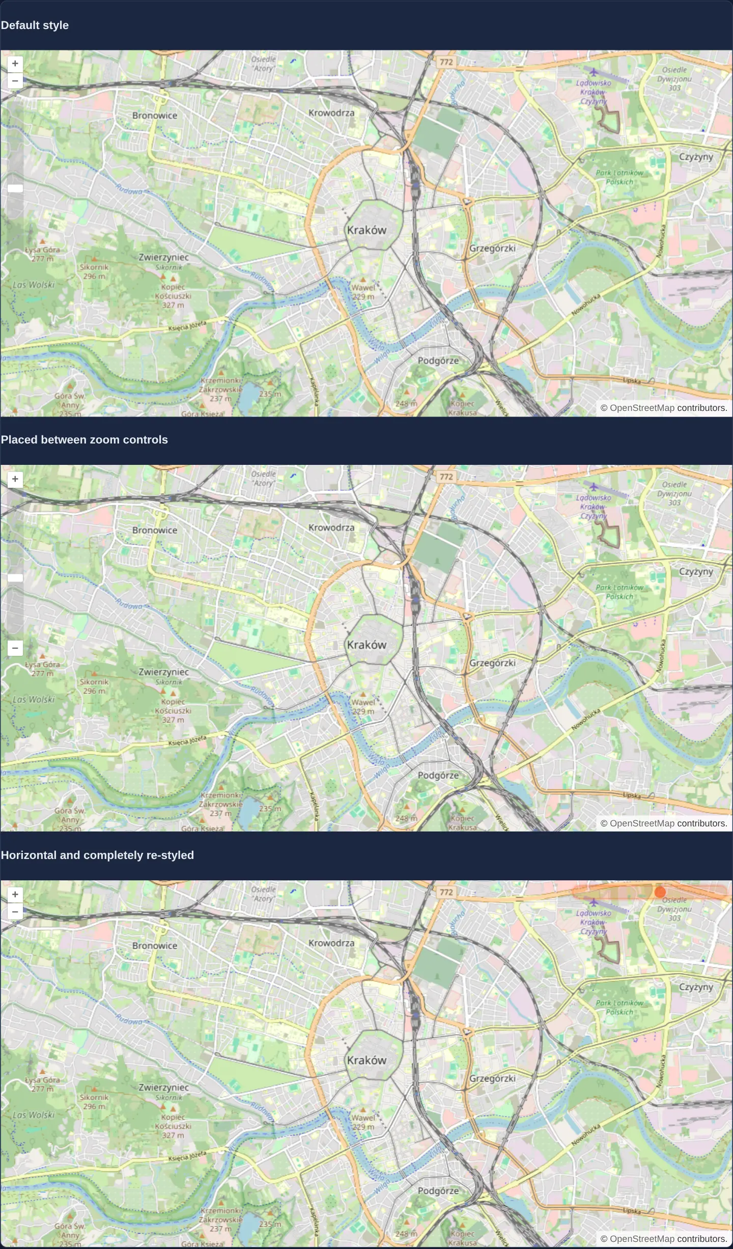
Three stacked street maps of central Kraków showcase how CSS alone transforms the exact same OpenLayers ZoomSlider control: first in its default vertical track beneath the +/− buttons, second nestled seamlessly between the + and − buttons as a unified navigation bar, and third restyled as a compact horizontal track in the top-right corner.
Dragging any thumb scales the map continuously, while clicking anywhere along the rail animates smoothly to that zoom level in 200 milliseconds.
When you need it
Step-by-step + and − buttons require tedious repeated clicks to jump from a national overview down to parcel scale and give no visual cue of how much zoom headroom remains.
Adding a ZoomSlider communicates current scale depth immediately and lets users scrub across the whole zoom range in a single drag while adapting cleanly to your application’s visual theme.
The code
The example uses cc-openlayers, my Angular component library for OpenLayers: each aol-… element creates the OpenLayers object it names, updates it from its inputs and disposes of it with the component.
zoomslider.tsimport { ChangeDetectionStrategy, Component } from '@angular/core';
import {
ControlZoomSliderComponent,
CoordinateComponent,
DefaultControlComponent,
DefaultInteractionComponent,
LayerTileComponent,
MapComponent,
SourceOsmComponent,
ViewComponent,
} from 'cc-openlayers';
/** Three maps with a zoom slider: the default one, one between the zoom buttons and a horizontal restyled one. */
@Component({
selector: 'app-zoomslider',
imports: [
ControlZoomSliderComponent,
CoordinateComponent,
DefaultControlComponent,
DefaultInteractionComponent,
LayerTileComponent,
MapComponent,
SourceOsmComponent,
ViewComponent,
],
changeDetection: ChangeDetectionStrategy.OnPush,
template: `
@for (variant of variants; track variant.title) {
<h4>{{ variant.title }}</h4>
<div [class]="variant.class">
<aol-map height="480px">
<aol-interaction-default />
<aol-control-defaults />
<aol-control-zoomslider />
<aol-view [zoom]="13">
<aol-coordinate [x]="19.9368" [y]="50.0614" srid="EPSG:4326" />
</aol-view>
<aol-layer-tile><aol-source-osm /></aol-layer-tile>
</aol-map>
</div>
}
`,
})
export class Zoomslider {
protected readonly variants = [
{ title: 'Default style', class: 'zoomslider-default' },
{ title: 'Placed between zoom controls', class: 'zoomslider-between' },
{ title: 'Horizontal and completely re-styled', class: 'zoomslider-horizontal' },
];
} The React version uses the library's React adapter, cc-openlayers/react: each component creates the OpenLayers object it names when it mounts, updates it from its props and disposes of it when it unmounts.
zoomslider.react.tsximport {
Coordinate,
DefaultControls,
DefaultInteractions,
Map,
OSMSource,
TileLayer,
View,
ZoomSliderControl,
} from 'cc-openlayers/react';
const variants = [
{ title: 'Default style', class: 'zoomslider-default' },
{ title: 'Placed between zoom controls', class: 'zoomslider-between' },
{ title: 'Horizontal and completely re-styled', class: 'zoomslider-horizontal' },
];
/** Three maps with a zoom slider: the default one, one between the zoom buttons and a horizontal restyled one. */
export function Zoomslider() {
return (
<>
{variants.map((variant) => (
<div key={variant.title}>
<h4>{variant.title}</h4>
<div className={variant.class}>
<Map height="480px">
<DefaultInteractions />
<DefaultControls />
<ZoomSliderControl />
<View zoom={13}>
<Coordinate x={19.9368} y={50.0614} srid="EPSG:4326" />
</View>
<TileLayer>
<OSMSource />
</TileLayer>
</Map>
</div>
</div>
))}
</>
);
}How the React version works
Three maps under headings each have a zoom slider; the gallery stylesheet restyles two of them through their containers' classes.
What both versions share
OpenLayers renders the map and handles the interactions; the cc-openlayers/core layer gives both adapters the same view binding (MapViewBinding) and the same conversion of coordinates from EPSG:4326 to the map's projection. The styles of the slider variants are in the gallery stylesheet.
From Angular to React
| Angular | React |
|---|---|
@for over the variants with aol-map and <aol-control-zoomslider> | variants.map(...) with key, Map and <ZoomSliderControl> |
Who creates, updates and disposes
Map creates the ol/Map in useLayoutEffect and disposes of it on unmount; each layer, source and interaction component adds its object to the parent it gets from context and removes it in its effect's cleanup, as ngOnDestroy does in Angular. The control is a child of Map, as in the Angular template; the adapter adds it to the map and removes it on unmount.
Architecture and OpenLayers mechanics
Each map mounts an identical aol-control-zoomslider inside a wrapper carrying zoomslider-default, zoomslider-between or zoomslider-horizontal. OpenLayers inspects the rendered CSS dimensions of the slider element on first paint: if its computed box is taller than wide it operates vertically, whereas making it wider than tall in CSS (zoomslider-horizontal) automatically switches thumb drag math to horizontal.
By default the track spans the view’s full zoom domain (0 to 28 unless constrained), positioning zoom 13 just below the midpoint.
How it works
aol-control-zoomslidermounts a draggable zoom thumb whose track clicks animate the view to the chosen scale over 200 ms.- Wrapper classes
zoomslider-default,zoomslider-betweenandzoomslider-horizontalreposition and restyle the control purely through CSS. - OpenLayers infers slider orientation from element geometry: styling the track wider than tall switches interaction mechanics from vertical to horizontal.
- Track position reflects the view’s configured zoom range (0–28 by default), placing city-centre zoom 13 near the middle of the rail.
Pitfalls
- OpenLayers determines vertical versus horizontal orientation once when the control first renders with non-zero dimensions—flipping aspect ratio later via a responsive media query will not update drag axis handling without recreating the control.
- Unconstrained views run up to zoom 28 even though OpenStreetMap tiles stop at zoom 19, leaving the upper third of the track overscaling blurry tiles; set maxZoom on the view so the slider spans only real data levels.
- In horizontal mode OpenLayers places maximum zoom-in on the left end and zoom-out on the right—the opposite of typical media sliders—so add clear icons or tooltips if users expect left-to-right zoom-in.
Related examples
The same feature in the OpenLayers examples .
Background: state and lifecycle of maps in Angular with OpenLayers, which the components of cc-openlayers take care of.