Essentials · Angular, React and OpenLayers
A full-screen map for phones
Fill mobile browser screens cleanly using a 100dvh OpenLayers viewport that centres on the first GPS fix at street level while allowing pans.
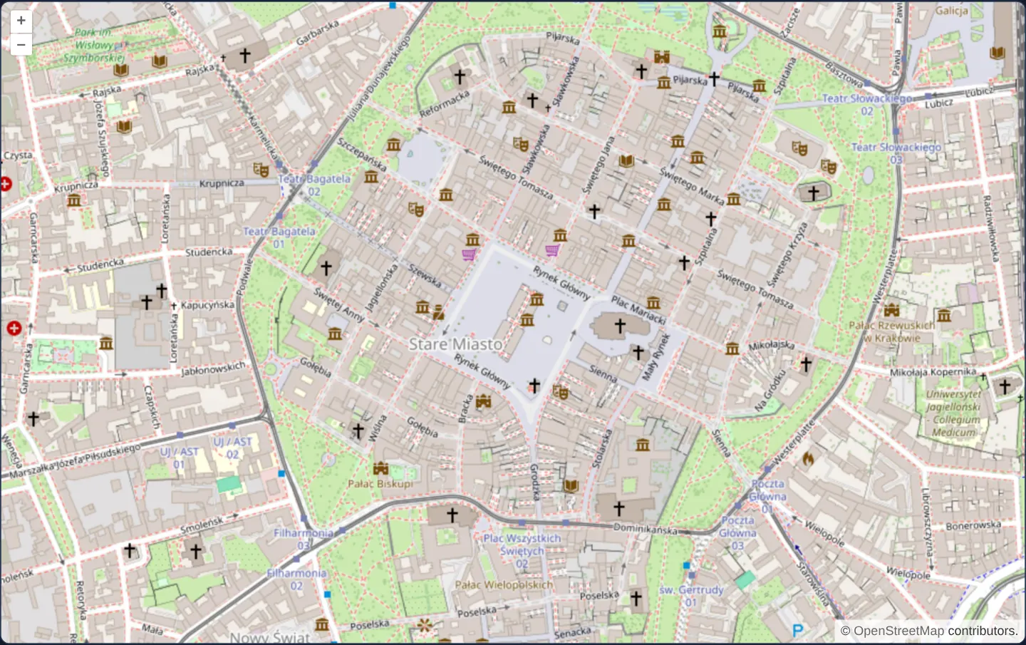
What this example shows
Designed for standalone mobile web apps, the map expands edge-to-edge across the full dynamic height of the device viewport (height="100dvh"), starts geolocation immediately over Kraków’s Main Square at zoom 12, and centres on your live position at street-level zoom 16 once the first fix arrives.
Once that initial lock frames your surroundings, automatic re-centring yields control so you can pan and explore nearby streets freely without GPS updates snapping the camera back.
When you need it
Dedicated mobile web utilities—such as city bike finders, parking meters, festival maps and field check-in screens—consist almost entirely of a full-bleed map starting at the user’s current street corner.
Mobile browsers dynamically retract and expand address and tab bars during touch interaction, causing classic 100vh layouts to overflow beneath browser chrome and clip bottom attribution or scale controls.
The code
The example uses cc-openlayers, my Angular component library for OpenLayers: each aol-… element creates the OpenLayers object it names, updates it from its inputs and disposes of it with the component.
mobile-full-screen.tsimport { ChangeDetectionStrategy, Component, viewChild } from '@angular/core';
import {
CoordinateComponent,
DefaultControlComponent,
DefaultInteractionComponent,
GeolocationComponent,
LayerTileComponent,
MapComponent,
SourceOsmComponent,
ViewComponent,
} from 'cc-openlayers';
/**
* A map as tall as the screen that follows the device: it tracks the position from the start and centres the first
* one at about 2.4 m per pixel (zoom 16). Meant for a phone, where the map fills the screen.
*/
@Component({
selector: 'app-mobile-full-screen',
imports: [
CoordinateComponent,
DefaultControlComponent,
DefaultInteractionComponent,
GeolocationComponent,
LayerTileComponent,
MapComponent,
SourceOsmComponent,
ViewComponent,
],
changeDetection: ChangeDetectionStrategy.OnPush,
template: `
<aol-map height="100dvh">
<aol-interaction-default />
<aol-control-defaults />
<aol-view [zoom]="12">
<aol-coordinate [x]="19.9368" [y]="50.0614" srid="EPSG:4326" />
</aol-view>
<aol-layer-tile><aol-source-osm /></aol-layer-tile>
<aol-geolocation [tracking]="true" (changePosition)="locate()" />
</aol-map>
`,
})
export class MobileFullScreen {
private readonly map = viewChild.required(MapComponent);
private readonly geolocation = viewChild.required(GeolocationComponent);
private located = false;
/** Centres the first position the device reports. */
protected locate(): void {
if (this.located) return;
this.located = true;
const view = this.map().instance.getView();
view.setCenter(this.geolocation().instance.getPosition());
view.setResolution(2.388657133911758);
}
} The React version uses the library's React adapter, cc-openlayers/react: each component creates the OpenLayers object it names when it mounts, updates it from its props and disposes of it when it unmounts.
mobile-full-screen.react.tsximport { useRef } from 'react';
import type OLGeolocation from 'ol/Geolocation.js';
import type OLMap from 'ol/Map.js';
import {
Coordinate,
DefaultControls,
DefaultInteractions,
Geolocation,
Map,
OSMSource,
TileLayer,
View,
} from 'cc-openlayers/react';
/**
* A map as tall as the screen that follows the device: it tracks the position from the start and centres the first
* one at about 2.4 m per pixel (zoom 16). Meant for a phone, where the map fills the screen.
*/
export function MobileFullScreen() {
const map = useRef<OLMap>(null);
const geolocation = useRef<OLGeolocation>(null);
const located = useRef(false);
/** Centres the first position the device reports. */
const locate = () => {
if (located.current) return;
located.current = true;
const view = map.current?.getView();
view?.setCenter(geolocation.current?.getPosition());
view?.setResolution(2.388657133911758);
};
return (
<Map ref={map} height="100dvh">
<DefaultInteractions />
<DefaultControls />
<View zoom={12}>
<Coordinate x={19.9368} y={50.0614} srid="EPSG:4326" />
</View>
<TileLayer>
<OSMSource />
</TileLayer>
<Geolocation ref={geolocation} tracking onChangePosition={locate} />
</Map>
);
}How the React version works
The map is as tall as the screen (100dvh), tracks the position from the start and centres the first position at about 2.4 m per pixel (zoom 16). Until then it shows Kraków at zoom 12. The example is meant for a phone.
What both versions share
OpenLayers renders the map and handles the interactions; the cc-openlayers/core layer gives both adapters the same view binding (MapViewBinding) and the same conversion of coordinates from EPSG:4326 to the map's projection. ol/Geolocation reports the position in the view's projection.
From Angular to React
| Angular | React |
|---|---|
[tracking]="true" | tracking without a value |
(changePosition)="locate()" | onChangePosition={locate} |
viewChild.required(MapComponent) and (GeolocationComponent) | two useRef calls passed as ref |
the class field located | useRef(false), because a change must not render |
Who creates, updates and disposes
Map creates the ol/Map in useLayoutEffect and disposes of it on unmount; each layer, source and interaction component adds its object to the parent it gets from context and removes it in its effect's cleanup, as ngOnDestroy does in Angular. The “already centred” flag lives in a useRef, so later positions do not move the map and the component does not render again.
Architecture and OpenLayers mechanics
Sizing the map host with CSS dynamic viewport units (height="100dvh") tracks the browser’s real visible height as mobile toolbars collapse and reappear, triggering OpenLayers’ internal resize observer automatically.
Enabling [tracking]="true" starts geolocation on load; the first (changePosition) event centres the view and calls setResolution(2.388657133911758) (Web Mercator zoom 16, ~1.5 m/px in Kraków), while a one-shot boolean guard prevents subsequent sensor ticks from hijacking manual user pans.
How it works
height="100dvh"matches the mobile browser’s dynamic viewport height so retracting address bars never clip bottom map controls.[tracking]="true"activates geolocation immediately and centres the camera on the first(changePosition)fix.setResolution(2.388657133911758)sets zoom level 16 (~2.4 m/px at the equator and ~1.5 m/px at Kraków’s latitude).- A one-time initialisation flag makes later fixes return early, so the camera stays exactly where the user panned it.
Pitfalls
- Using 100vh instead of
100dvhon iOS Safari and mobile Chrome sizes the container taller than the visible window while toolbars are open, hiding bottom-corner attributions. - Starting
[tracking]="true"immediately triggers the browser’s location permission prompt on initial page load; in multi-purpose apps, prefer a user-initiated “Locate me” button instead.
Related examples
The same feature in the OpenLayers examples .
Background: state and lifecycle of maps in Angular with OpenLayers, which the components of cc-openlayers take care of.