Controls · Angular, React and OpenLayers
A styled overview map that rotates with the view
Customize an OpenLayers OverviewMap control with CSS classes, custom toggle labels and optional view-synchronized rotation in Angular apps.
What this example shows
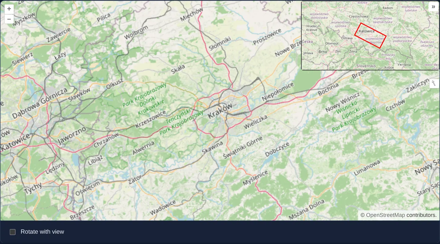
Over the Kraków region north-up, a wide 300-pixel custom-styled overview inset sits in the top-right corner sporting a red viewport indicator box and « / » collapse chevrons.
Toggling the Rotate with view checkbox below the map switches between two orientation modes: keeping the overview north-up while the red extent box tilts inside it, or rotating the entire overview map alongside the main camera so the red box stays upright.
When you need it
Corridor viewers, aviation charts and custom-branded enterprise GIS apps often outgrow the tiny default bottom-left square inset—needing a wider rectangular locator positioned in a different corner and aligned with rotated headings.
Combining custom CSS classes with rotateWithView adapts the built-in OverviewMap control to bespoke design systems without writing a second synchronized map from scratch.
The code
The example uses cc-openlayers, my Angular component library for OpenLayers: each aol-… element creates the OpenLayers object it names, updates it from its inputs and disposes of it with the component.
overviewmap-custom.tsimport { ChangeDetectionStrategy, Component, signal } from '@angular/core';
import TileLayer from 'ol/layer/Tile';
import OSM from 'ol/source/OSM';
import {
CoordinateComponent,
DefaultControlComponent,
DefaultInteractionComponent,
DragRotateAndZoomInteractionComponent,
LayerTileComponent,
MapComponent,
SourceOsmComponent,
ViewComponent,
} from 'cc-openlayers';
import { ControlOverviewMapComponent } from 'cc-openlayers/overview';
/**
* An overview map in the top right corner with its own class and styles (in the gallery's styles.css); Shift and
* drag rotates the map, and the overview may rotate with it.
*/
@Component({
selector: 'app-overviewmap-custom',
imports: [
ControlOverviewMapComponent,
CoordinateComponent,
DefaultControlComponent,
DefaultInteractionComponent,
DragRotateAndZoomInteractionComponent,
LayerTileComponent,
MapComponent,
SourceOsmComponent,
ViewComponent,
],
changeDetection: ChangeDetectionStrategy.OnPush,
template: `
<aol-map height="480px">
<aol-interaction-default />
<aol-interaction-dragrotateandzoom />
<aol-control-defaults />
<aol-control-overviewmap
className="ol-overviewmap ol-custom-overviewmap"
[layers]="overviewLayers"
collapseLabel="»"
label="«"
[collapsed]="false"
[rotateWithView]="rotateWithView()"
/>
<aol-view [zoom]="9">
<aol-coordinate [x]="19.9368" [y]="50.0614" srid="EPSG:4326" />
</aol-view>
<aol-layer-tile><aol-source-osm /></aol-layer-tile>
</aol-map>
<div class="example-controls">
<label>
<input name="rotateWithView" type="checkbox" [checked]="rotateWithView()" (change)="toggle($event)" />
Rotate with view
</label>
</div>
`,
})
export class OverviewmapCustom {
/** OpenLayers' overview map shows only the layers it is given. */
protected readonly overviewLayers = [new TileLayer({ source: new OSM() })];
readonly rotateWithView = signal(false);
protected toggle(event: Event): void {
this.rotateWithView.set((event.target as HTMLInputElement).checked);
}
} The React version uses the library's React adapter, cc-openlayers/react: each component creates the OpenLayers object it names when it mounts, updates it from its props and disposes of it when it unmounts.
overviewmap-custom.react.tsximport { useState } from 'react';
import TileLayer from 'ol/layer/Tile.js';
import OSM from 'ol/source/OSM.js';
import {
Coordinate,
DefaultControls,
DefaultInteractions,
DragRotateAndZoomInteraction,
Map,
OSMSource,
OverviewMapControl,
TileLayer as MapTileLayer,
View,
} from 'cc-openlayers/react';
/**
* An overview map in the top right corner with its own class and styles (in the gallery's styles.css); Shift and
* drag rotates the map, and the overview may rotate with it.
*/
export function OverviewmapCustom() {
/** OpenLayers' overview map shows only the layers it is given. */
const [overviewLayers] = useState(() => [new TileLayer({ source: new OSM() })]);
const [rotateWithView, setRotateWithView] = useState(false);
return (
<>
<Map height="480px">
<DefaultInteractions />
<DragRotateAndZoomInteraction />
<DefaultControls />
<OverviewMapControl
className="ol-overviewmap ol-custom-overviewmap"
layers={overviewLayers}
collapseLabel="»"
label="«"
collapsed={false}
rotateWithView={rotateWithView}
/>
<View zoom={9}>
<Coordinate x={19.9368} y={50.0614} srid="EPSG:4326" />
</View>
<MapTileLayer>
<OSMSource />
</MapTileLayer>
</Map>
<div className="example-controls">
<label>
<input
name="rotateWithView"
type="checkbox"
checked={rotateWithView}
onChange={(event) => setRotateWithView(event.target.checked)}
/>
Rotate with view
</label>
</div>
</>
);
}How the React version works
The overview map in the top right corner has its own class and labels, Shift and a drag rotate the map, and a checkbox makes the overview rotate with the view.
What both versions share
OpenLayers renders the map and handles the interactions; the cc-openlayers/core layer gives both adapters the same view binding (MapViewBinding) and the same conversion of coordinates from EPSG:4326 to the map's projection. The ol-custom-overviewmap class is in the gallery stylesheet.
From Angular to React
| Angular | React |
|---|---|
<aol-control-overviewmap className label collapseLabel [rotateWithView]> | <OverviewMapControl className label collapseLabel rotateWithView={rotateWithView}> |
<aol-interaction-dragrotateandzoom /> | <DragRotateAndZoomInteraction /> |
(change)="toggle($event)" | the checkbox's onChange |
Who creates, updates and disposes
Map creates the ol/Map in useLayoutEffect and disposes of it on unmount; each layer, source and interaction component adds its object to the parent it gets from context and removes it in its effect's cleanup, as ngOnDestroy does in Angular. The control is a child of Map, as in the Angular template; the adapter adds it to the map and removes it on unmount. A change of rotateWithView calls the setter of the existing control.
Architecture and OpenLayers mechanics
Setting className="ol-overviewmap ol-custom-overviewmap" preserves OpenLayers’ base structural rules while adding a custom hook used by the stylesheet to anchor a 300-pixel-wide inset in the top-right corner and colour its extent box red. Custom collapseLabel="»" and label="«" match the right-edge folding direction, and [collapsed]="false" opens it initially.
When [rotateWithView] toggles, the wrapper recreates the underlying OpenLayers control with the new boolean option while reusing the stable overviewLayers array instantiated once on the component.
How it works
className="ol-overviewmap ol-custom-overviewmap"retains OpenLayers’ base CSS rules while applying top-right 300 px placement and red-box styling.collapseLabel="»",label="«"and[collapsed]="false"orient the fold button toward the right edge and start the inset expanded.- Rotating the main map with Shift+drag tilts only the red indicator box by default, or turns the entire overview basemap when Rotate with view is checked.
- Holding
overviewLayersas a stable class field lets the recreated control reuse the same dedicated tile layer cleanly when[rotateWithView]changes.
Pitfalls
classNamereplaces OpenLayers’ default class string rather than appending to it—always includeol-overviewmapalongside your custom class or the inset loses its foundational positioning and button layout.- As with the basic overview control, never pass layer instances already mounted on the main map into
overviewLayers.
Related examples
The same feature in the OpenLayers examples .
Background: state and lifecycle of maps in Angular with OpenLayers, which the components of cc-openlayers take care of.