Controls · Angular, React and OpenLayers
Tooltips on map controls
Attach and dispose Bootstrap tooltips on OpenLayers zoom and rotation control buttons for hover and keyboard focus in Angular and React apps.
What this example shows
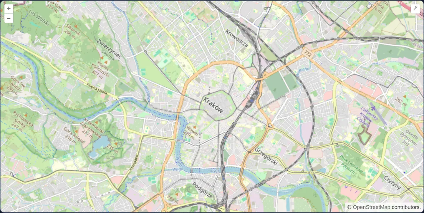
Hovering the mouse over—or tabbing with the keyboard onto—OpenLayers’ built-in +, − and compass-reset buttons opens styled Bootstrap tooltip popovers explaining each button’s action.
When you need it
Enterprise dashboards standardised on Bootstrap, Material or custom design-system tooltips often replace sluggish native browser title tooltips on map toolbar buttons with instant, keyboard-accessible UI tooltips.
Integrating third-party DOM tooltip instances cleanly with OpenLayers controls requires deterministic disposal when the map component unmounts.
The code
The example uses cc-openlayers, my Angular component library for OpenLayers: each aol-… element creates the OpenLayers object it names, updates it from its inputs and disposes of it with the component.
button-title.css.button-title-map {
position: relative;
}
.button-title-map .tooltip {
position: absolute;
z-index: 1000;
display: block;
margin: 0;
font-size: 0.8rem;
line-height: 1.4;
pointer-events: none;
}
.button-title-map .tooltip-inner {
max-width: 200px;
padding: 0.3rem 0.55rem;
color: white;
background: #182029;
border-radius: 0.25rem;
text-align: center;
}
.button-title-map .tooltip-arrow {
position: absolute;
width: 0.8rem;
height: 0.4rem;
}button-title.css.d.ts/** The stylesheet is loaded for its scoped side effect by the bundler. */
export {};button-title.html<div class="button-title-map">
<aol-map height="480px">
<aol-interaction-default /><aol-control-defaults />
<aol-view [zoom]="13" [rotation]="rotation"
><aol-coordinate [x]="19.9368" [y]="50.0614" srid="EPSG:4326"
/></aol-view>
<aol-layer-tile><aol-source-osm /></aol-layer-tile>
</aol-map>
</div>button-title.shared.tsimport Tooltip from 'bootstrap/js/dist/tooltip';
/** Attach tooltips only to the controls owned by this map. */
export function attachControlTooltips(container: HTMLElement): () => void {
const mapContainer = container.querySelector<HTMLElement>('.button-title-map') ?? container;
const labels = [
['.ol-zoom-in', 'Zoom in'],
['.ol-zoom-out', 'Zoom out'],
['.ol-rotate-reset', 'Reset rotation'],
];
const tooltips = labels.flatMap(([selector, title]) =>
[...mapContainer.querySelectorAll<HTMLElement>(selector)].map((button) => {
// Bootstrap removes title; symbolic controls still need a persistent accessible name.
if (!button.hasAttribute('aria-label')) button.setAttribute('aria-label', title);
return new Tooltip(button, { container: mapContainer, title, animation: false, trigger: 'hover focus' });
})
);
return () => tooltips.forEach((tooltip) => tooltip.dispose());
}button-title.tsimport {
afterNextRender,
ChangeDetectionStrategy,
Component,
DestroyRef,
ElementRef,
inject,
ViewEncapsulation,
} from '@angular/core';
import {
CoordinateComponent,
DefaultControlComponent,
DefaultInteractionComponent,
LayerTileComponent,
MapComponent,
SourceOsmComponent,
ViewComponent,
} from 'cc-openlayers';
import { attachControlTooltips } from './button-title.shared';
@Component({
selector: 'app-button-title',
imports: [
CoordinateComponent,
DefaultControlComponent,
DefaultInteractionComponent,
LayerTileComponent,
MapComponent,
SourceOsmComponent,
ViewComponent,
],
changeDetection: ChangeDetectionStrategy.OnPush,
templateUrl: './button-title.html',
styleUrl: './button-title.css',
encapsulation: ViewEncapsulation.None,
})
export class ButtonTitle {
protected readonly rotation = Math.PI / 5;
constructor() {
const host = inject<ElementRef<HTMLElement>>(ElementRef);
const destroy = inject(DestroyRef);
afterNextRender(() => {
const dispose = attachControlTooltips(host.nativeElement);
destroy.onDestroy(dispose);
});
}
} The React version uses the library's React adapter, cc-openlayers/react: each component creates the OpenLayers object it names when it mounts, updates it from its props and disposes of it when it unmounts.
button-title.react.tsximport { useEffect } from 'react';
import { unByKey } from 'ol/Observable';
import {
Coordinate,
DefaultControls,
DefaultInteractions,
Map,
OSMSource,
TileLayer,
View,
useMap,
} from 'cc-openlayers/react';
import { attachControlTooltips } from './button-title.shared';
import './button-title.css';
function ControlTooltips() {
const map = useMap();
useEffect(() => {
let dispose = () => {};
const refresh = () => {
dispose();
const host = map.getTargetElement()?.closest<HTMLElement>('.button-title-map');
if (host) dispose = attachControlTooltips(host);
};
refresh();
const key = map.getControls().on(['add', 'remove'], refresh);
return () => {
unByKey(key);
dispose();
};
}, [map]);
return null;
}
export function ButtonTitle() {
return (
<div className="button-title-map">
<Map height="480px">
<DefaultInteractions />
<DefaultControls />
<ControlTooltips />
<View zoom={13} rotation={Math.PI / 5}>
<Coordinate x={19.9368} y={50.0614} srid="EPSG:4326" />
</View>
<TileLayer>
<OSMSource />
</TileLayer>
</Map>
</div>
);
}button-title.shared.tsimport Tooltip from 'bootstrap/js/dist/tooltip';
/** Attach tooltips only to the controls owned by this map. */
export function attachControlTooltips(container: HTMLElement): () => void {
const mapContainer = container.querySelector<HTMLElement>('.button-title-map') ?? container;
const labels = [
['.ol-zoom-in', 'Zoom in'],
['.ol-zoom-out', 'Zoom out'],
['.ol-rotate-reset', 'Reset rotation'],
];
const tooltips = labels.flatMap(([selector, title]) =>
[...mapContainer.querySelectorAll<HTMLElement>(selector)].map((button) => {
// Bootstrap removes title; symbolic controls still need a persistent accessible name.
if (!button.hasAttribute('aria-label')) button.setAttribute('aria-label', title);
return new Tooltip(button, { container: mapContainer, title, animation: false, trigger: 'hover focus' });
})
);
return () => tooltips.forEach((tooltip) => tooltip.dispose());
}How the React version works
Add Bootstrap tooltips to the zoom and rotation controls in Angular and React.
What both versions share
Tooltip instances belong to the map controls and are disposed when their example unmounts.
From Angular to React
| Angular | React |
|---|---|
| A view query locates the map controls after rendering. | An effect locates the committed map controls. |
| An external Angular template declares the example. | JSX declares the example and its controls. |
| The Angular lifecycle releases the mounted resources. | Effect or subscription cleanup releases the mounted resources. |
Who creates, updates and disposes
Each tooltip is disposed with its host controls. The stylesheet stays scoped to the example.
Architecture and OpenLayers mechanics
After the map mounts its default zoom and rotation controls, Bootstrap Tooltip instances attach directly to the control <button> elements inside the map viewport—responding to both pointer hover and keyboard :focus—and are explicitly disposed of during Angular/React teardown so orphaned popover nodes never linger in document.body.
How it works
- Bootstrap Tooltip instances bind to the mounted OpenLayers control buttons and dispose deterministically when the component unmounts.
Pitfalls
- Visual tooltips supplement a button’s accessible name—always preserve proper
aria-labelor button text so screen readers announce the control even before a tooltip opens.
Related examples
The same feature in the OpenLayers examples .
Background: state and lifecycle of maps in Angular with OpenLayers, which the components of cc-openlayers take care of.